Designing Recursive
By Stephen Nixon, @ArrowType
In 2018, I graduated with an MA in Type Design from TypeMedia, a 10-month immersion in type at the Royal Academy of Art (KABK) in The Hague, Netherlands. For my thesis project, I created Recursive, a typeface exploring the intersection of sign painting, code, and the emerging technology of variable fonts. In 2019, Google Fonts commissioned me to complete the project for open-source distribution. Recursive is now the first release of my new type foundry, ArrowType.
An origin in painted letters
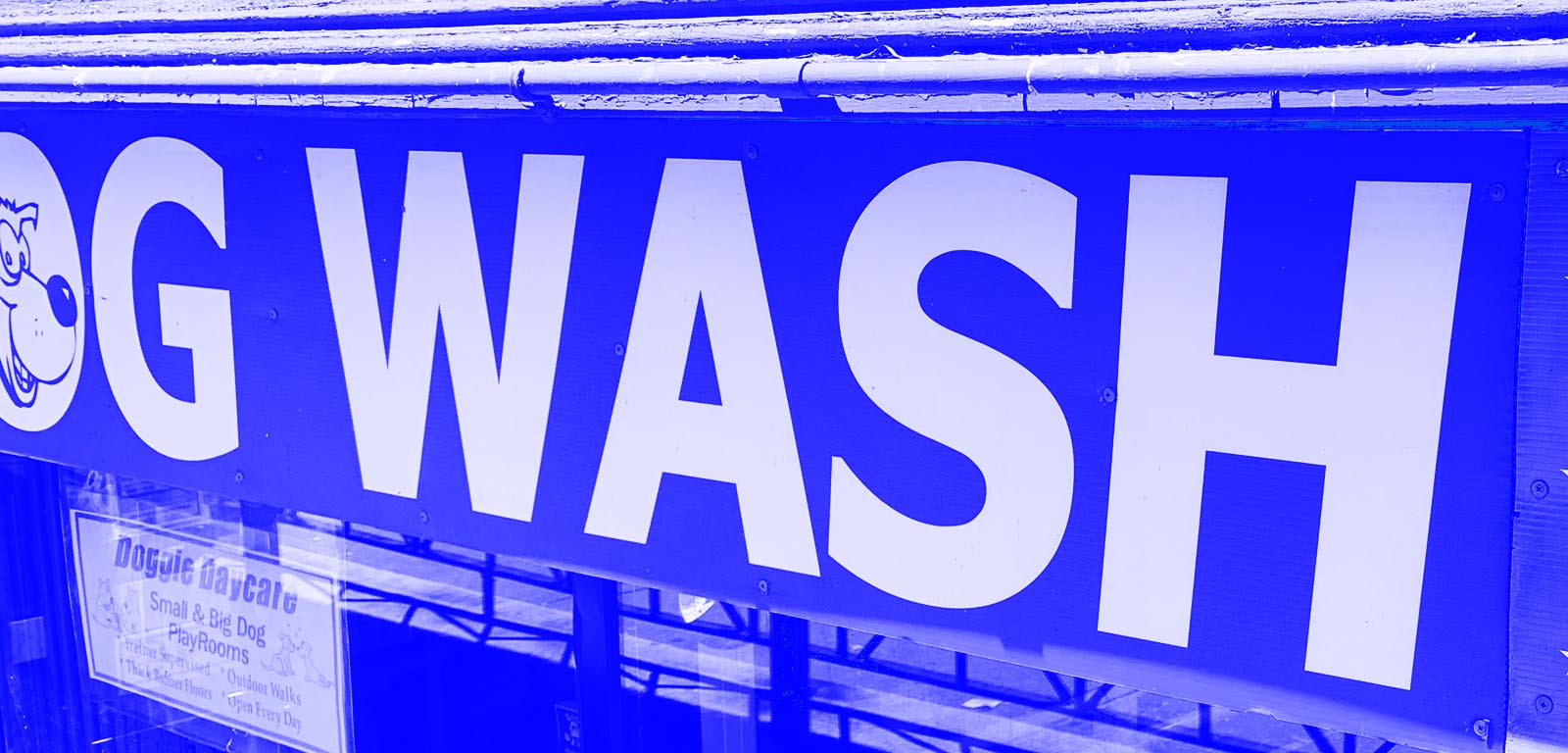
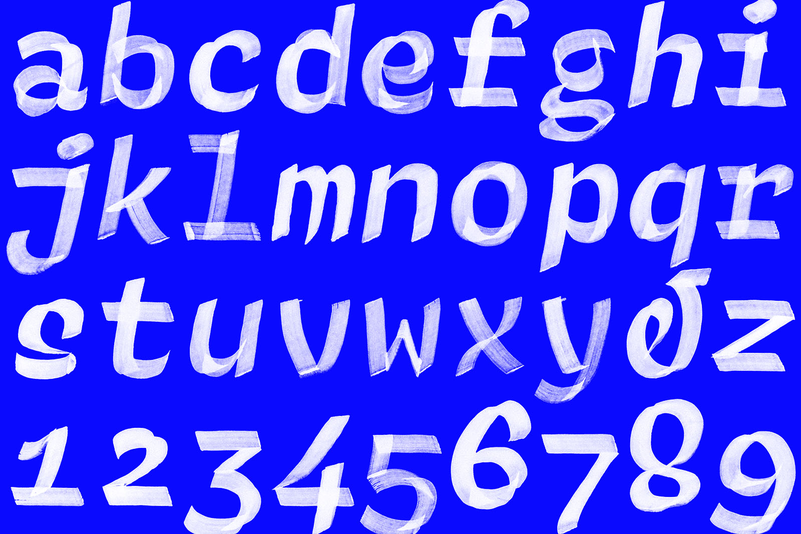
One of my favorite styles of signwriting is a genre broadly referred to as casual. It includes casual script, in which letters are handwritten with a brush and connected together. It also includes single-stroke casual, which is typically painted in uppercase, forward-slanted letters.
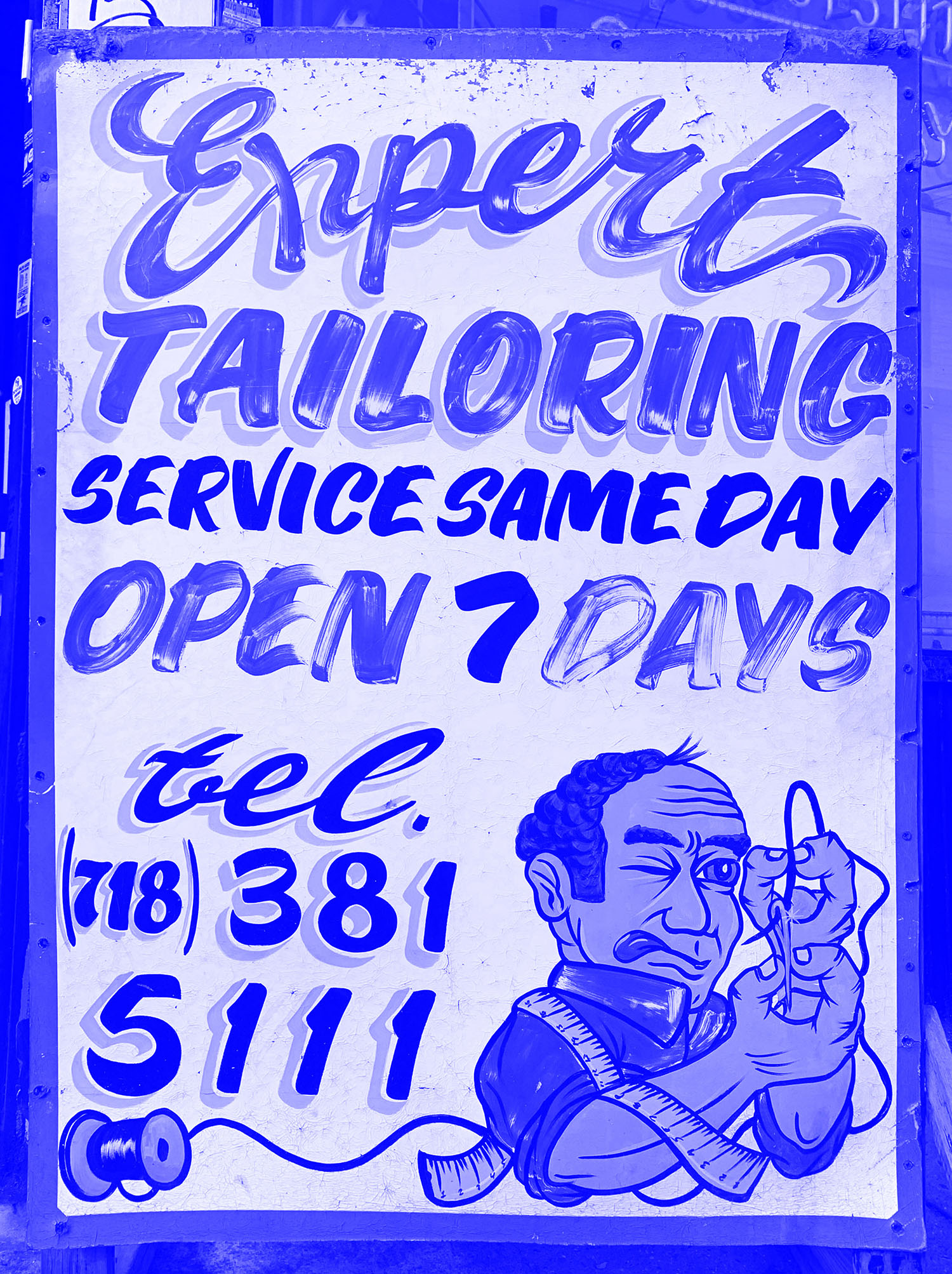
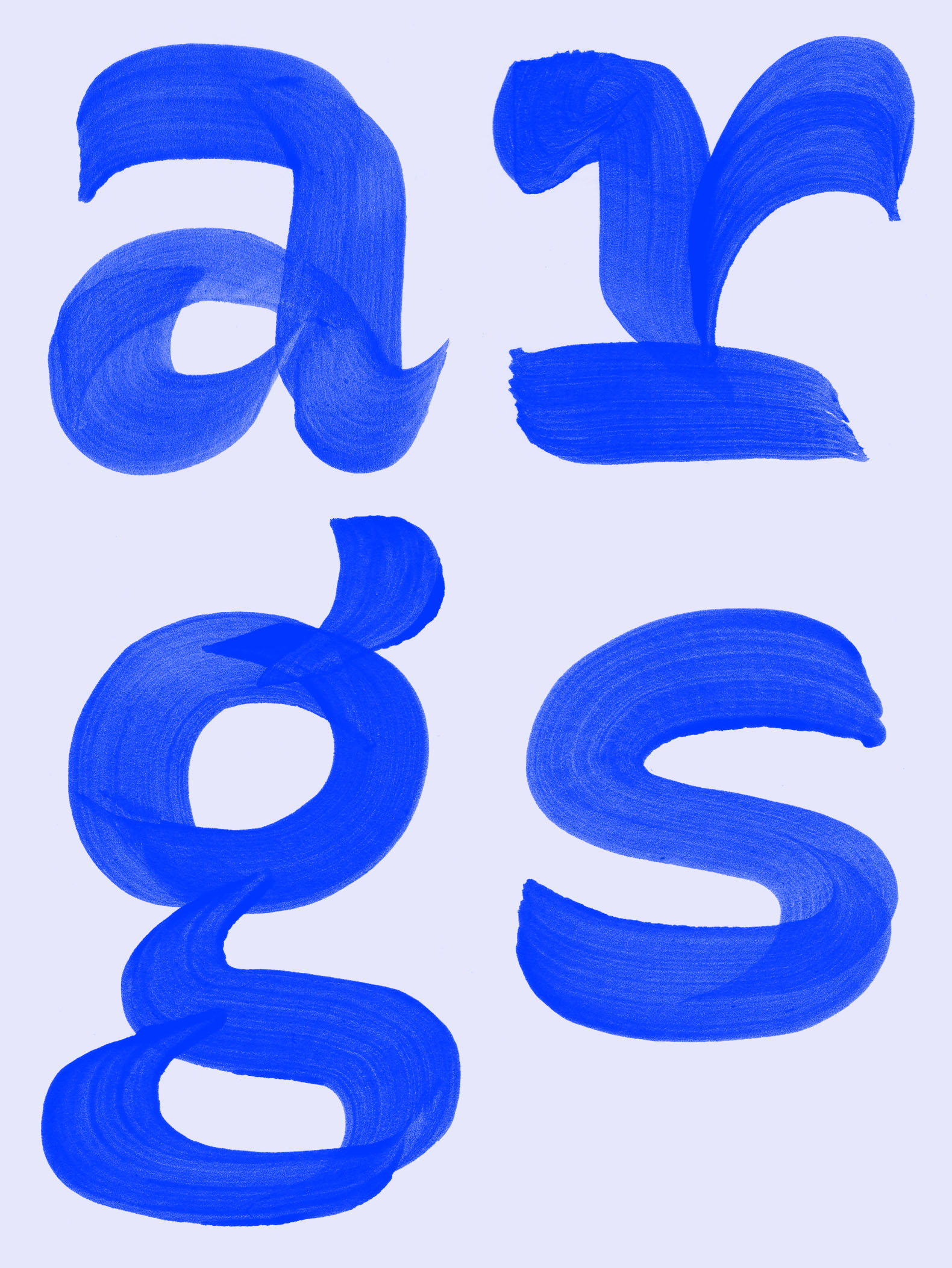
A foundational style for sign painters, single-stroke casual consists of just a few basic strokes which are assembled together to create letters. As a result, this style is highly practical, easy to learn, and (relatively) easy to paint. Its features are deliberately informal and “unbalanced”: letters are somewhat condensed and have curved stems, stroke connections are left visibly imperfect, and midpoints are low-slung. These qualities allow a sign painter to avoid some of the aspects of letter shaping that can be most challenging: perfectly straight lines, rigid symmetry, and optically-centered elements like the spine in of the letter ‘S’.
There are many single-stroke casual fonts. It is a genre that lends itself to looking good in many different stylistic variations – even stretched, slanted, or outlined. What could be a better foundation, then, for a variable font with a monospaced core and a wide range of styles?
Living in New York City, I come across striking works of casual lettering & fonts almost daily in the vernacular signage of diners, laundromats, bodegas, and commercial vehicles. Recursive is shaped by my love of these signs, as well as by lessons learned from classmates Gen Ramírez & Seán Donohoe, teachers at TypeMedia, and educators like John Downer, plus a lot of personal sketching and technical experimentation.
Contemporary influences
Along with sign painting, Recursive is also influenced by many modern-day typefaces. Flattened terminals come from my love/hate feelings towards Verdana when used at a large size on signage. It is a font meant for screens, so it looks both a little bit terrible and a little bit awesome in this odd context.
I especially love many of the fonts made for code, and if you have spent time with these, you will recognize their influence on Recursive: Input by DJR & Type Bureau, Operator by Andy Clymer & Hoefler&Co, Covik by James Edmonson / OHno Type Co, Space Mono by Colophon, Fira Code by Nikita Prokopov & Mozilla / Carrois Studio, SF Mono by Apple, IBM Plex Mono by Mike Abbink & Bold Monday, and the classic Menlo / Vera Mono by Jim Lyles & Bitstream.
I’m not seeking to replace any of these other code fonts with Recursive, but rather I find that they all have good ideas yet also leave room for more good ideas. After all, many coders spend many hours every day reading & writing monospace fonts in code editors and terminals. Just as there are many models of office chairs that serve different personal physical & aesthetic needs, different developers have different requirements which will be fit better by different fonts. I crafted Recursive to serve the range of needs & preferences I have, and I hope others will find it useful, as well.
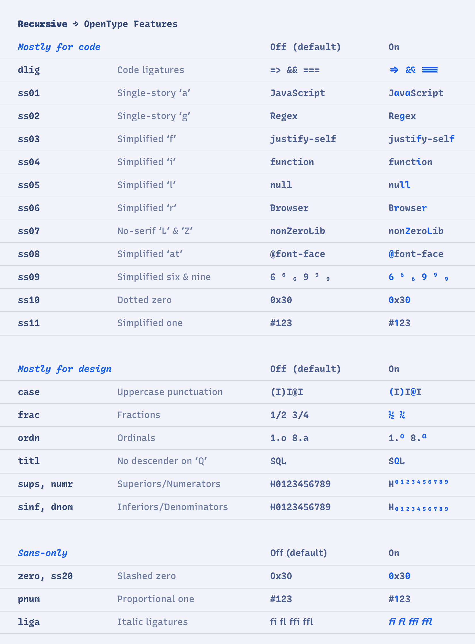
(Side note: if the default letterforms of Recursive aren’t to your preference, many of these are configurable via Stylistic Sets.)
(Additional side note for the folks that like code ligatures: code ligatures exist in the core fonts of Recursive under the “discretionary ligatures” dlig OpenType feature, but releases also include versions specifically for code which have code ligatures activated by default and a few other hacks to make them work more seamlessly in more code environments.)
Crafting a casual for code
Early on in the design process, one thing stood out about single-stroke casuals: not only could they be squeezed into condensed proportions or stretched into extremely wide styles, but they were particularly eye-catching when worked into the confines of monospaced letters. This realization left me wanting to explore what a single-stroke casual monospace font could be. With my background in web design and development, creating a font for use in programming that would be both highly readable and aesthetically pleasing was an exciting challenge. Moreover, it was a perfect opportunity for me to design a font that would meet my requirements both as a designer and as a developer.
Most typefaces with both sans-serif and monospace variants are first designed to be proportional and later adapted into a fixed-width alternative. With Recursive, I decided to design going in the other direction. Starting with a monospace and adapting it into a sans-serif was an unconventional approach, but because I was most curious to see how casual letters might look in code, it felt natural to follow this direction.
In this project, I have given particular attention to adapting the key visual aspects of single-stroke casuals into simplified monospaced and semi-proportional letterforms. I preserved their low center points and chiseled stroke endings but set their forward slant to a variable axis. Keeping some casual gestures helps to maintain the warmth and energy of the style, while simplification makes it practical for everyday typographic use.
The need for multiple voices
Because the typeface was started from painted letters, it had a lot of personality from the beginning. For it to work well in code and on screen, however, I knew I needed to temper its personality and improve its readability. Finding the exact right voice was challenging. From my own experience, I knew that developers have different typographic needs based on the task at hand. Some monospace fonts are drawn with attention-grabbing details, which lends them a strong visual impact for display settings like posters and signage, but can make them distracting to code with. Other monospace fonts are designed with only traditional legibility in mind, but this can give them a cold and monotonous tone when used in settings such as docs and blogs.
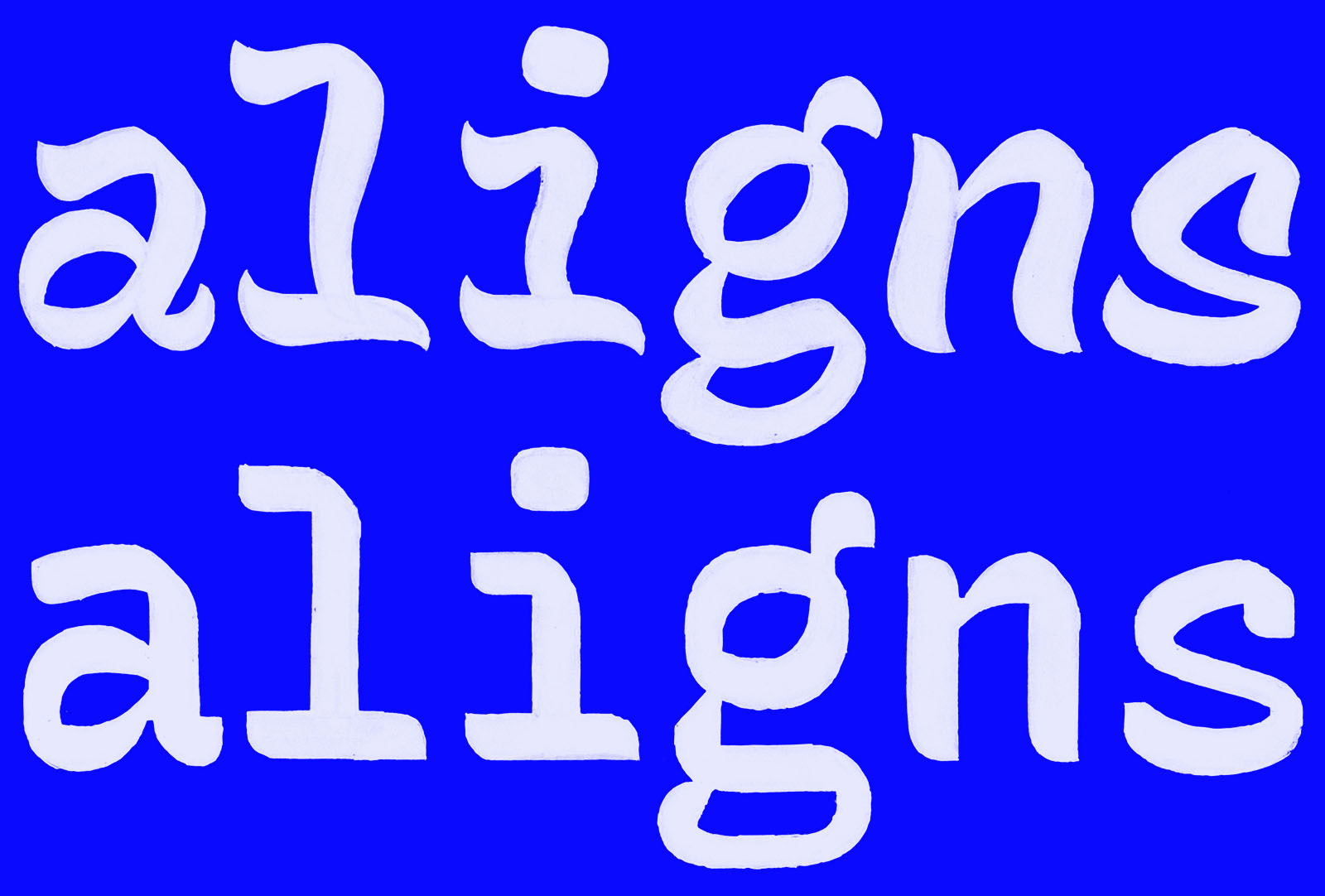
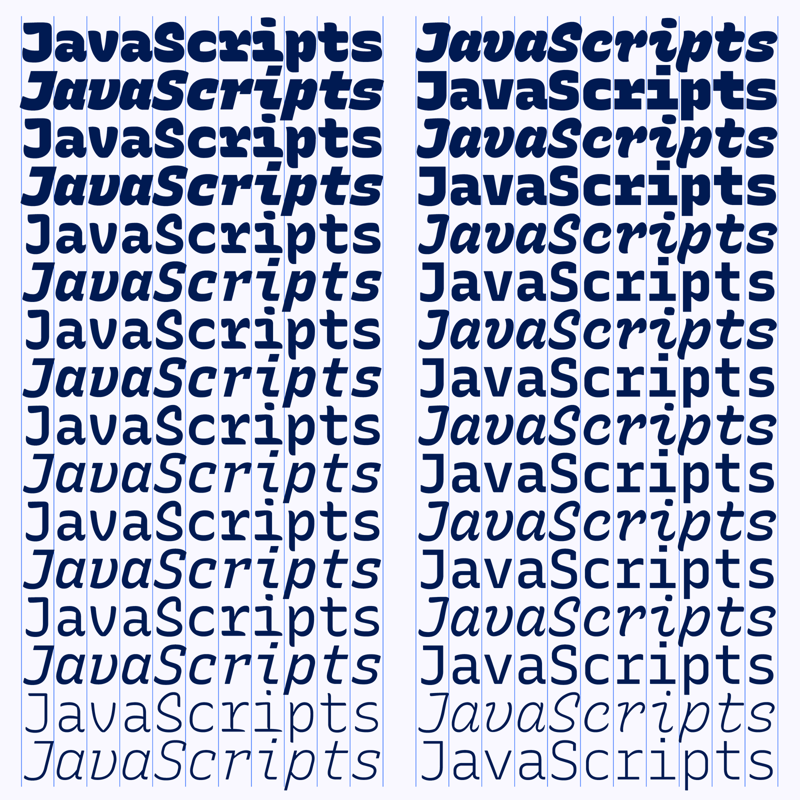
This was a contradiction that I began to realize from my earliest sketches. Still, I wanted to make Recursive a monospace font that could be ideal in different contexts, from serious to casual. I soon had the idea to solve this issue with the addition of a variable axis, but knew that it would have clear design constraints. I needed to find two ends of a continuous spectrum that could be different enough to be striking counterparts while also both functioning well at the small sizes used for code. Finding the ends of this spectrum was a process of many rounds of trial and failure, but things gradually improved, helped greatly by a steady stream of critique from professors and visiting designers at TypeMedia. Today, I often use the Casual styles in my terminal and the Linear style in code – or more often, a mix of both with a custom “Duotone” family (available in Recursive releases) and a code theme that supports italic syntax highlighting.
Adding a variable axe for stylistic range was not just a design challenge, but also a demanding technical endeavor. When adding the Casual axis, I had to draw for interpolation compatibility, making every glyph twice – first with brushy contours for the Casual end of the axis, then again with rectangular shaping for the Linear end of the axis. What made this difficult is that both versions of each glyph had to match in the number and order of contours, nodes, anchors, and more. This was to ensure that they would be compatible for the interpolation required to morph along this stylistic range.
Despite the challenge of production, a spectrum of expression within a single typeface has clear advantages for users. Some of the most compelling typographic layouts use multiple, complementary fonts. However, because different fonts usually have different metrics, such layouts can easily become a headache for visual design and technical implementation. Recursive, by contrast, provides multiple voices from a single, easy-to-use font file.
Expanding the possibilities to interactive design
No matter how versatile, a monospace font is only truly suited for a particular set of tasks (especially those which benefit from characters that are tabular and non-ambiguous, such as code, financial data, passwords, receipts, license numbers, serial numbers, captions, and more). Because I intended Recursive for a wide range of use, I knew from early on that it needed a proportional counterpart. However, starting with a monospace design helped me find opportunities to make a Sans that could offer unique possibilities for interactive design.
Just as a monospace font maintains the same widths for letters between all weights and styles, I realized that my sans-serif could do the same: while all characters would have natural widths, each could keep its same width across all stylistic variations. I therefore built Recursive Sans as a superplexed family – all of its 32 instances have shared glyph width, kerning, and overall letterforms for every character. Of course, this also applies to in-between variations. The fact that characters within Recursive Sans have shared metrics ensures that line length is not affected when changing between its different font styles. This also allows smooth, animated transitions between any of the subfamily’s Weight, Slant, & Casual axes.
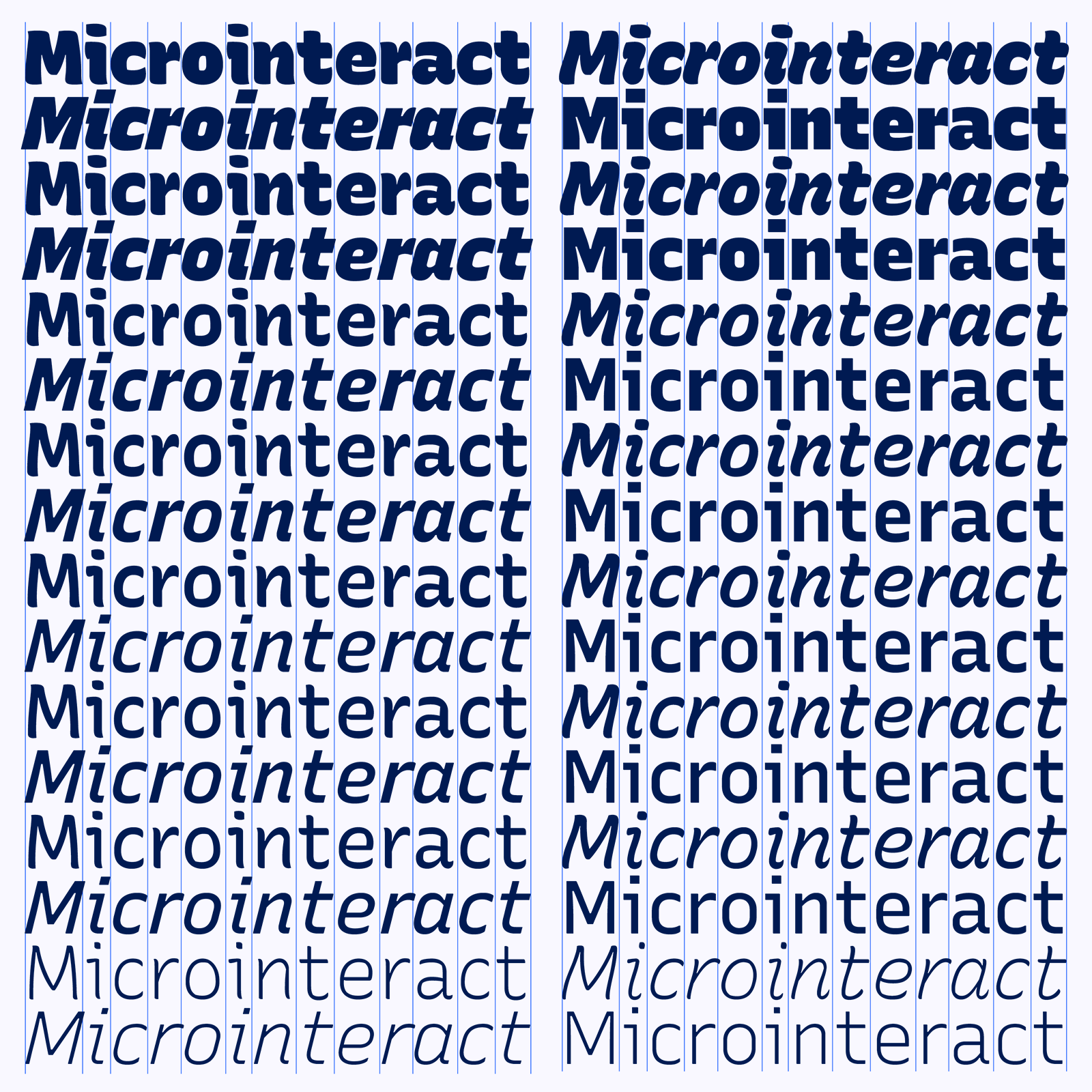
These design decisions were based on my understanding of user needs: before moving into type design, I worked as a visual designer for websites and software. In these past roles, my responsibility was to enhance the user experience of digital products, with a particular focus on typographic clarity and microinteractions (subtle animations in digital user interfaces that respond to user interaction through visual changes such as color, size, and position). Through this, I found that most typefaces are terrible when used in animated transitions due to their shifting metrics and non-variable styles. With Recursive, I realized that I could find a way around these limitations.
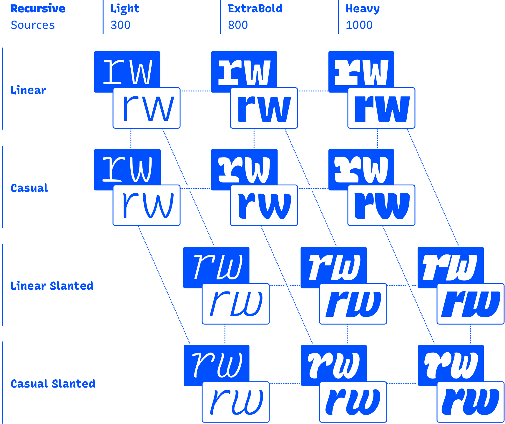
Bringing a five-axis variable font to life sometimes seemed like a never-ending process. In a variable font, the number of drawings required for each glyph tends to go up with the addition of every axis. Between Casual, Monospace, Weight, Slant, & Italic axes, Recursive required 24 total source font files. Each character required at least 12 compatible drawings to cover Casual, Weight, and Slant variations – and characters with Monospace and Italic variations required even more drawings. All told, Recursive has 1,248 glyphs per source – and between its 24 sources, Recursive includes 29,952 total glyphs. Of course, a significant portion of these are composed from other glyphs (as is the case for most accented characters) or copied between sources (“normal-width” glyphs were copied from Mono to Sans sources), but there are still 6,804 hand-edited glyphs. This staggering amount of complexity made it critical to embrace scripting to automate parts of the process. This is also why it was so incredibly helpful to have the contribution of type designers Lisa Huang and Katja Schimmel and good software from many type-tool engineers.
A new font testing tool, Type-X
While designing Recursive, it was important to search for typographic problems across all styles in order to fix them and improve the font. This process, called proofing, typically means physically printing pages to show a broad character set in all styles across a range of point sizes. Proofs are often typeset in realistic graphic layouts, then carefully examined and marked for revision. A concise proof may easily have two to four pages per style – so repeatedly proofing all 64 instances of Recursive wasn’t a good option. It wouldn’t have just been a waste of resources, but also a disregard of time constraints: most collaborative proofing sessions only have time to analyze a few pages in detail.
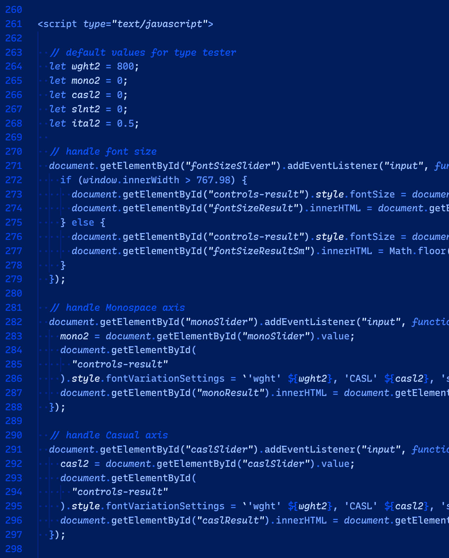
From the start, then, I sought ways of testing Recursive that would require printing fewer pages, instead relying on better screen-based tests. I started making JavaScript-generated layouts and other digital examples as the basis of my critique. However, I soon felt limited by trying to create realistic web typography examples without actually using real web content and styling. Eventually, it became clear that the best way to assess Recursive’s design on screen was to see how it performed on real, live websites. I began to browse different websites, adding custom CSS rules to override their fonts with Recursive. In this way, I could preview and test the different styles of Recursive at the same time in a more-realistic context.
This process was useful, but it was also repetitive and time consuming. Worse, it didn’t allow me to sit back and actually experience the fonts. I eventually realized that I could automate this workflow. To do so, I created a simple Google Chrome extension that could override fonts on any webpage at the touch of a button, imposing my own font files onto those pages. It made proofing Recursive online much more efficient, and it helped me find many opportunities for refinements that I may have otherwise missed.
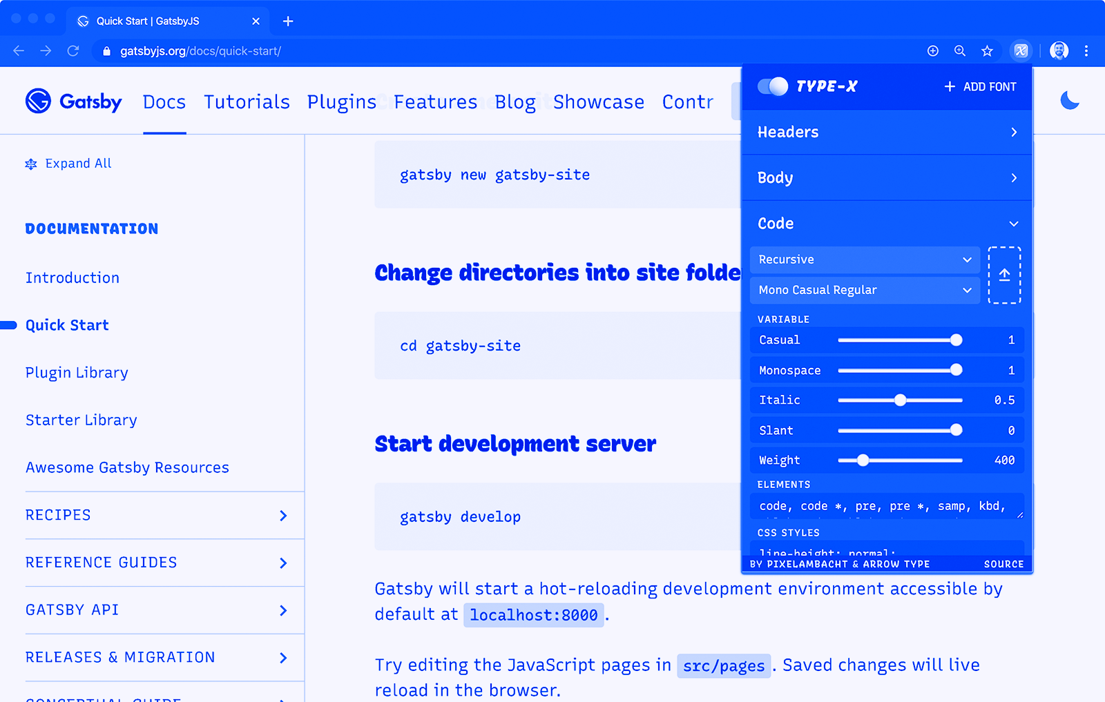
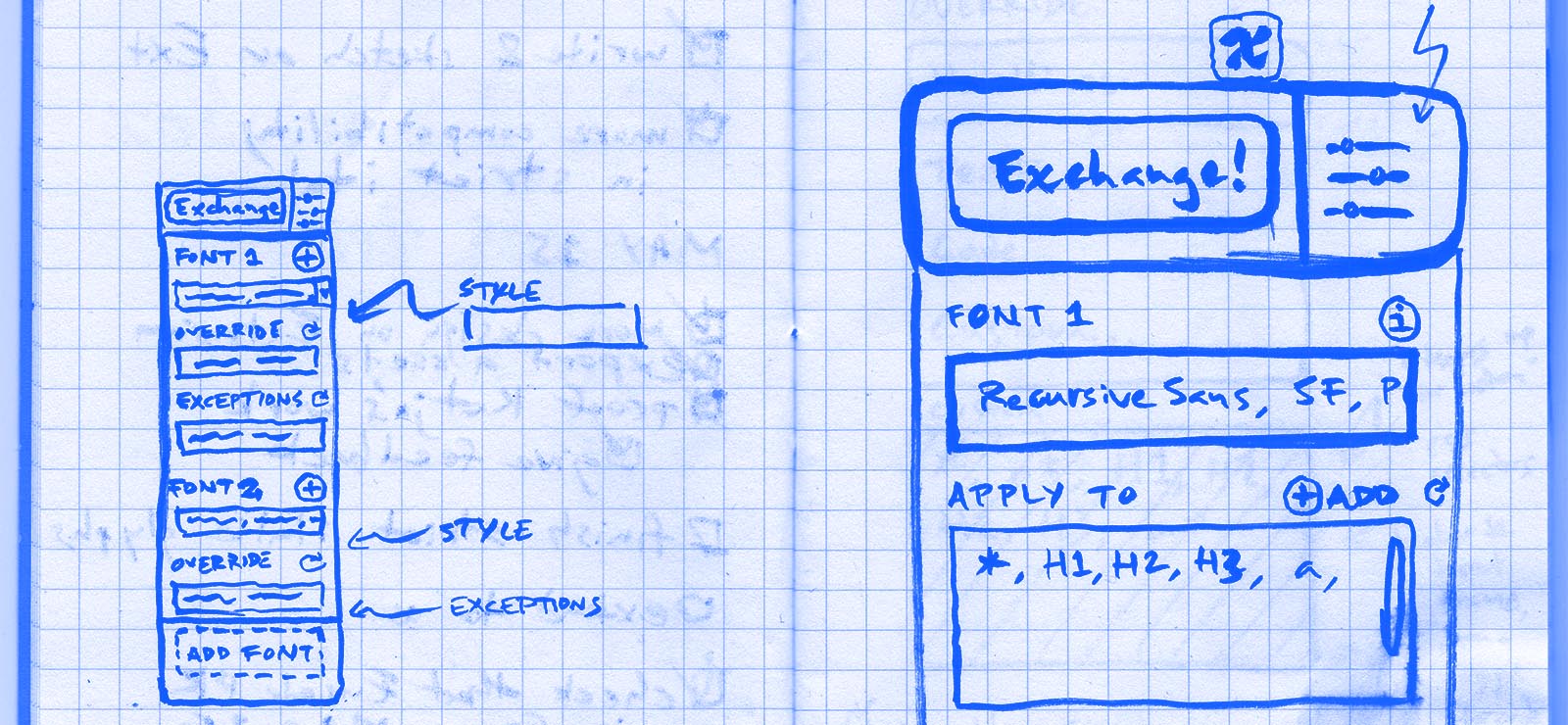
In the past year, I worked with developer Roel Neiskens to redesign and rebuild this Chrome extension, in what we now call Type-X. Whereas my earlier tool was limited to a single, hard-coded font family, Type-X allows users to easily override websites with any font on their system. Font files can also be drag-and-dropped into the extension to activate advanced features like variable axis control. These new capabilities make Type-X far more powerful than a simple type-proofing tool: it is now useful to anyone wanting to better understand how different fonts look and feel in the context of the websites they use. Thanks to the sponsorship of Google Fonts, Type-X is now open source and available to anyone for free on the Chrome Web Store.
I couldn’t have done it alone
Designing Recursive has been a long but enriching (and fun!) process. It would not have been possible without the help of the many people who contributed their knowledge, critique, and time. I am especially grateful to Google Fonts for commissioning me to complete my thesis, to E Roon Kang, Bon Hae Koo, Minkyoung Kim, Talia Cotton, Irin Kim, and Noemi Stauffer for helping make the project look and sound so good, to Lisa Huang and Katja Schimmel for helping me to complete the drawing of it, to Ben Kiel for helping to engineer the final fonts, to Rafał Buchner, Erik van Blokland, Tal Lemming, and Frederik Berlaen (and many other type engineers) for making tools that made this design possible, to Gen Ramírez, Seán Donohoe, and John Downer for inspiration and lessons in sign painting, to the faculty and alumni of TypeMedia for their mentorship and guidance, and to all the other designers and developers who shared their insights along the way.